How to Change Links Color/Style in Blogger
Blog design has always been a great challenge for bloggers. Remember, quality content is not the only thing required for making a blog successful, but we also have to give attention to its design that how your blog looks. If your blog design is clean and attractive, then the visitors will get more interested in your blog. There are thousands of blogger templates available on the internet, but not a single template comes with 100% fulfillment. We have to customize its different sections and elements. Links color is also one of the. If you want to make links more visible and stands out from other text or, want to make the design more attractive to enhance user experience, then its important that you customize your link color/style and that's what we are going to learn today. Today in this tutorial we'll show you that How to Change Links Color/Style in Blogger.

The text in bold will be different for every template, simply search for a { tag and you'll find the above code. The first line is for you line style before hover (color:#2aa4cf;) and the seconds line is for the link style on hover (color:#000000; ). So by changing the styles and colors you can easily customize your links style. Use our HTML Color code generator to find your color code.
Got a question? Please don't hesitate, ask us in the comments section below.
How to Change Links Color in Blogger
First and foremost log in to your Blogger Account and go to Template >> Edit HTML. Now look for the CSS code of the hyperlink in your template, which would be something like the below codea { color:#2aa4cf;}
a:hover { color:#000000; }
The text in bold will be different for every template, simply search for a { tag and you'll find the above code. The first line is for you line style before hover (color:#2aa4cf;) and the seconds line is for the link style on hover (color:#000000; ). So by changing the styles and colors you can easily customize your links style. Use our HTML Color code generator to find your color code.
From Editors Desk
We hope this article may've helped you in learning How to Change Links Color/Style in Blogger. Share it with your friedns and dont forget to subscribe us!Got a question? Please don't hesitate, ask us in the comments section below.

.png "How to Customize Blockquote in Blogger")
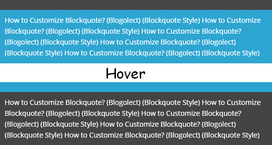.png "How to Customize Blockquote in Blogger")