Don't Miss

Latest Posts
Browsing Category "CSS Tricks"

How to Create Drop Caps (Big First Letter) in Blogger

- 30 Comments
Hi Bloggers, today I'm sharing an amazing CSS trick known as Drop Caps (Big First Letter). This trick is still being used by some top websites. This trick Enlarges the first letter of each blog post on your blog and gives a unique and professional look to your blog. You might have seen this trick on some top websites. If you ever wished to use this trick on your blog, then you're at the right place. Today in this tutorial I'll show you that How to Create Drop Caps (Big First Letter) in Blogger. Let's begin:

Recommended for You:
How to Create Drop Caps (Big First Letter) in Blogger

How to Create Drop Caps (Big First Letter) in Blogger

First and foremost go to Blogger.com and log in to your Blogger Account. Go to Template >> Edit HTML >> Click inside the code area >> Press Ctrl+F to search and search for the below tag

]]></b:skin>

 Now copy the below code and add it just above/before it (]]></b:skin>)

.capital:first-letter {
color: #000000;
float: left;
margin:0px 5px 0 0;
font-size: 38px;
font-family: Times, serif, Georgia;
display: block;
padding:0 0 0 10px;
}

Now again search for the below tag

<data:post.body/>

And then add the green tags before and after it as shown below

<div class='capital'><data:post.body/></div>

Click Save Template button and check your blog. If the above code is not working then try the below two methods (Skip the above line and try the below one, add the green codes before and after)

<p class="capital"><data:post.body/></p>

Or Try this:

<span class="capital"><data:post.body/></span>

Finally Click Save Template button and you're done!

We hope this article may have helped you in learning How to Create Drop Caps (Big First Letter) in Blogger. Share this article with your friends and don't forget to subscribe us!

How to Create an Animated CSS3 Drop Down Menu in Blogger

- 26 Comments
A Navigation Bar or Drop Down Menu is one of the most essential elements of a blog. A drop down menu makes your blog user-friendly, allowing your visitors to easily navigate your blog by simply choosing their desired category from the menu. Apart of all these advantages it also gives your website a new unique and professional look. Almost all the website either its a top website or a newly created are using Drop Down Menus. Recently we shared an article on How to Create a Drop Down Menu in Blogger. The design of that menu was simple and the one we're going to share today has a stylish and professional look with eye catching CSS transitions. Lets begin:
How to Create an Animated CSS3 Drop Down Menu in Blogger

How to Create an Animated CSS3 Drop Down Menu in Blogger

First and foremost, log in to your Blogger Account >> Select a Blog >> Template and click Edit HTML. Click inside the template code area, press Ctrl+F to search and search for the ]]></b:skin> tag. Now copy the below CSS code and paste it just above/before the ]]></b:skin> tag

a, #navigation li .sub-nav-wrapper .sub-nav li {
 transition: all 0.7s;
 -moz-transition: all 0.7s;
 -webkit-transition: all 0.7s;
}
#navigation li .sub-nav-wrapper {
 pointer-events: none;
 opacity: 0;
 filter: alpha(opacity=0);
 top: 0;

 transition: all 0.4s cubic-bezier(1,-5,0,0) 0s;
 -moz-transition: all 0.4s cubic-bezier(1,-5,0,0) 0s;
 -webkit-transition: all 0.4s cubic-bezier(1,-5,0,0) 0s;
}
#navigation li:hover .sub-nav-wrapper {
 pointer-events: auto;
 opacity: 1;
 filter: alpha(opacity=100);
 top: 30px;
}
#navigation {
 position: relative;
 text-align:center;
 margin:0 auto;
 background-color:#fff;
 border-bottom: 2px solid #009999;
}
#navigation li {
 position: relative;
 list-style: none;
 display: inline-block;
 padding: 5px 20px;
}
#navigation li a {
 padding: 5px;
 display: block;

 font-family: 'Open Sans', Arial, Helvetica, sans-serif;
 font-size: 14px;
 font-weight: 700;
 color: #3b3b3b;
 text-align: left;
 text-shadow: 1px 1px 0 rgba(255,255,255,0.25);
}
#navigation li:hover .main {
 color: #ee4e1d;
}
#navigation li .sub-nav-wrapper {
 display: block;
 position: absolute;
 z-index: 30;
 margin-left: -16px;
}
#navigation li .sub-nav-wrapper .sub-nav {
 width: 150px;
 margin-top: 6px;
 background: #fff;
 border-top: 1px solid #fff;
 padding:0;
 box-shadow: 0 1px 2px rgba(0,0,0,0.35);
 -moz-box-shadow: 0 1px 2px rgba(0,0,0,0.35);
 -webkit-box-shadow: 0 1px 2px rgba(0,0,0,0.35);
}
#navigation li:hover .sub-nav-wrapper {
 display: block;
}
#navigation li .sub-nav-wrapper .sub-nav li {
 list-style: none;
 display: block;
 margin: 0;
 padding: 0;
 text-align: left;
 border-bottom: 1px solid #009999;
}
#navigation li .sub-nav-wrapper .sub-nav li:last-child {
 border: none;
}
#navigation li .sub-nav-wrapper .sub-nav li a {
 display: block;
 padding: 11px 20px;
 font-size: 12px;
 font-weight: 600;
}
#navigation li a:hover {
color: white;
}
#navigation li .sub-nav-wrapper .sub-nav li:hover {
 background: #009999;
 border-bottom: 1px solid #009999;
 color: #3b3b3b;
 text-decoration: none;
}

CSS done, its time for HTML. Search for the <body> tag. Copy the below HTML code and Paste it Just below/after the <body> tag.
Note: You can add HTML wherever you want.

<ul id="navigation">

    <li>
        <a href="index.html" class="main">Home</a>
    </li>
   
    <li>
        <a href="#" class="main">Blogger</a>
        <div class="sub-nav-wrapper"><ul class="sub-nav">
            <li><a href="#">Tips</a></li>
            <li><a href="#">Widgets</a></li>
            <li><a href="#">Traffic Tips</a></li>
        </ul></div>
    </li>
   
    <li>
      <a href="#" class="main">Services</a>
        <div class="sub-nav-wrapper"><ul class="sub-nav">
            <li><a href="#">Blogger</a></li>
            <li><a href="#">Logo</a></li>
 <li><a href="#">Banner</a></li>
            <li><a href="#">Wordpress</a></li>
        </ul></div>
    </li>
   
    <li>
      <a href="#" class="main">Tutorials</a>
        <div class="sub-nav-wrapper"><ul class="sub-nav">
            <li><a href="#">Logo</a></li>
            <li><a href="#">HTML/CSS</a></li>
            <li><a href="#">Design</a></li>
            <li><a href="#">Illustrator</a></li>
            <li><a href="#">Web Design</a></li>
        </ul></div>
    </li>
   
    <li>
      <a href="#" class="main">About</a>
        <div class="sub-nav-wrapper"><ul class="sub-nav">
            <li><a href="#">Website</a></li>
            <li><a href="#">Our Team</a></li>
            <li><a href="#">Our Mission</a></li>
        </ul></div>
    </li>
   
    <li>
      <a href="#" class="main">Contact</a>
    </li>
   
</ul>

  • Replace the Categories with your own and replace # with their links

Finally click Save Template button and you're done!

We hope this article may have helped you in learning How to Create an Animated CSS3 Drop Down Menu in Blogger. Share this article with your friends and don't forget to subscribe us!

How to Customize Labels Cloud Widget in Blogger v3

- 21 Comments
Are you fed up with the ugly design of default blogger Labels Cloud Widget? Do you want to make it more prominent and attention grabbing? Labels Cloud is a Widget provided by Blogger that allows you to categorize your content under specific labels. Labels widget makes your blog user-friendly by allowing your visitors to easily navigate to the content they are looking for by choosing the categories/labels.
Customize Labels Cloud Widget in Blogger v3
The default blogger Labels Cloud widget is simple and leaves a bad impression on your visitors that's why we've to customize it. Labels cloud widget can be easily customized using CSS. If you don't know that how to customize it? Don't worry, in this tutorial we'll show you that How to Turn that Ugly label design into a stylish and clean design. We've designed these labels by using CSS and Animated Gradient effect. Let's begin:

Recommended For You:
How to Customize Labels Cloud Widget in Blogger v1
How to Customize Labels Cloud Widget in Blogger v2
Customized Flat UI Labels Cloud widget for Blogger v1
Customized Flat UI Labels cloud widget for Blogger v2

How to Customize Labels Cloud Widget in Blogger

First and foremost, Log in to your Blogger Account >> Select a Blog >> Template and click Edit HTML. Click inside the template code area and by using Ctrl+F search for the ]]></b:skin> tag. Now choose a style from the below three styles, copy its code and paste it just above/before it (]]></b:skin> Tag)

Note: There is no difference in the coding of the below three styles. The only difference is their colors, we did this to show you that there is nothing technical if you want to match its color with your blog theme. You can change the color by changing the bolded text in the CSS code and use our Color Code Generator 1 and Color Code Generator 2 for HTML color codes.

Style# 1

How to Customize Labels Cloud Widget in Blogger
.label-size {
  position:relative;
  text-transform: uppercase;
  text-decoration:none;
  font-size:13px;
  font-family:Open Sans;
  color:#fff!important;
}

.label-size a {
  color:#fff!important;
  font-weight:bold;
  padding:8px 10px;
  margin:0 6px 6px 0;
  float:left;
  display:block;
  -moz-transition: all 0.4s ;
  -o-transition: all 0.4s;
  -webkit-transition: all 0.4s ;
  -ms-transition: all 0.4s ;
  transition: all 0.4s ;
  background-image: linear-gradient(#EE4343, #E07C7C);
  background-size: auto 200%;
  background-position: 0 100%;
  transition: background-position 0.5s;border-bottom:3px solid #000000;
}

.label-size a:hover {
  background-position: 0 0;
}

Style# 2

How to Customize Labels Cloud Widget in Blogger
.label-size {
  position:relative;
  text-transform: uppercase;
  text-decoration:none;
  font-size:13px;
  font-family:Open Sans;
  color:#fff!important;
}

.label-size a {
  color:#fff!important;
  font-weight:bold;
  padding:8px 10px;
  margin:0 6px 6px 0;
  float:left;
  display:block;
  -moz-transition: all 0.4s ;
  -o-transition: all 0.4s;
  -webkit-transition: all 0.4s ;
  -ms-transition: all 0.4s ;
  transition: all 0.4s ;
  background-image: linear-gradient(#00FF3B, #778C7C);
  background-size: auto 200%;
  background-position: 0 100%;
  transition: background-position 0.5s;border-bottom:3px solid #000000;
}

.label-size a:hover {
  background-position: 0 0;
}

Style# 3

How to Customize Labels Cloud Widget in Blogger
.label-size {
  position:relative;
  text-transform: uppercase;
  text-decoration:none;
  font-size:13px;
  font-family:Open Sans;
  color:#fff!important;
}

.label-size a {
  color:#fff!important;
  font-weight:bold;
  padding:8px 10px;
  margin:0 6px 6px 0;
  float:left;
  display:block;
  -moz-transition: all 0.4s ;
  -o-transition: all 0.4s;
  -webkit-transition: all 0.4s ;
  -ms-transition: all 0.4s ;
  transition: all 0.4s ;
  background-image: linear-gradient(#8A8C8B, #1A1D1B);
  background-size: auto 200%;
  background-position: 0 100%;
  transition: background-position 0.5s;border-bottom:3px solid #000000;
}

.label-size a:hover {
  background-position: 0 0;
}

Finally click Save Template button and you're done.

We hope this article may have helped you in learning How to Customize Labels Cloud Widget in Blogger. Share this article with your friends and don't forget to subscribe us!

4 Cool CSS Tricks to Spice Up your Blog

- 5 Comments
No doubt! Every Blogger loves CSS. CSS is used for styling webpages, customizing colors, layout etc. Almost everything that we do for styling our blog is based on CSS. There are thousands of amazing things that you can do with CSS. Even if you've been learning CSS for many years, you probably still come to new things, new values, new effects/tricks and properties you've never used.
4 Cool CSS Tricks to Spice Up your Blog
So, lets learn some new CSS tricks today, that you can use to spice up your blog. In this tutorial we'll share 4 Cool CSS tricks that you might find useful.

3D Text

Create a 3D effect for your text using this simple CSS code. Add this CSS code to the CSS code of that element which you want to make 3D. You can make it look more cool by changing its color.

text-shadow:   1px 0px #eee, 0px 1px #ccc,
                      2px 1px #eee, 1px 2px #ccc,
                      3px 2px #eee, 2px 3px #ccc,
                      4px 3px #eee, 3px 4px #ccc,
                      5px 4px #eee, 4px 5px #ccc,
                      6px 5px #eee, 5px 6px #ccc,
                      7px 6px #eee, 6px 7px #ccc,
                      8px 7px #eee, 7px 8px #ccc,
                      8px 8px #eee;

Check the Image below to see how it Looks.
3d text effect using css blogolect

Blurry Text

Turn your normal text to a cool blurry text using CSS. Use the below CSS code to create a blurry text and grab your visitors attention :)

.blur {
   color: transparent;
   text-shadow: 0 0 4px rgba(0,0,0,0.6);
}

Check the Image below to see how it Looks.
blurry text effect using css blogolect

Flip an Image

Sounds crazy! You can flip images with CSS. Try this amazing effect for your blog. Use the below CSS to Flip an Image.

img {
        -moz-transform: scaleX(-1);
        -o-transform: scaleX(-1);
        -webkit-transform: scaleX(-1);
        transform: scaleX(-1);
        filter: FlipH;
        -ms-filter: "FlipH";
}

Before you try this effect, have a look at the image below.
flipped image effect using css blogolect

Animated Gradient Effect

Create animated gradient effect for your blog buttons. Use the below CSS to create animated gradient effect. You can also use this effect for styling your labels widget.

.button {
background-image: linear-gradient(#518712, #124555);
background-size: auto 200%;
background-position: 0 100%;
transition: background-position 0.5s;
}
.button:hover {
background-position: 0 0;
}

We hope you enjoyed this article and also learned some new CSS tricks. We'll cover some more tutorials on CSS this week. Stay Tuned!

Share these tricks with your friends, don't forget to subscribe us and Join our Bloggers Forum on Facebook @ https://www.facebook.com/groups/blogolectforum

How to Customize Popular Posts Widget in Blogger

- 27 Comments
Are you fed up because of the yucky and unclean design of the blogger Popular Posts Widget? Do you want to make your Popular Posts widget more prominent and attractive for your readers? Popular Posts is a widget provided by blogger, which allows you to display Popular Posts on your sidebar or footer. This widget shows the most visited posts of a blog, you have four different combinations for displaying this widget i.e.

1- Only the title of the post
2- Post title with summary
3- Post title with image thumbnail
4- Post title with image thumbnail and summary

Having a popular posts widget in the sidebar has a lot of advantages. It helps your visitors to check the most visited/popular posts of your blog, it encourages your visitors to navigate your content and the visitors will get more interested in your content. Therefore, if you want to stylize/customize the popular posts widget, and you want to make it more attractive for your visitors. In this article, we'll show you that How to Customize Popular Posts Widget in Blogger. Let's begin:
How to Customize Popular Posts Widget in Blogger

How to Customize Popular Posts Widget in Blogger

First and foremost, Log in to your Blogger Account >> Select a Blog >> Template and click Edit HTML. Click inside the template code area and by using Ctrl+F search for the ]]></b:skin> tag. Now copy the below code and paste it just above/before it (]]></b:skin> Tag)

.PopularPosts {
background: #fff; 
}
.popular-posts ul {
  margin: 0 !important;  padding: 0 !important; 
}
.PopularPosts img {  background: #fff;  border: 3px solid #CCCCCC;  display: block;  float: left;  height: 48px;  margin-right: 8px;  padding: 2px;  width: 48px;  
}
.PopularPosts .widget-content { 
font-size: 15px;  margin: 0 !important; 
}
.popular-posts ul li { 
list-style: none;  border-bottom: 1px solid #ccc;  border-top: 1px solid #FFFFFF;  padding: 0 !important;
}
.popular-posts ul li:hover {
background: #fafafa;  text-decoration: none; 
}
.popular-posts ul li a {
  color: #404040;  display: block; 
}
.popular-posts ul li a:hover { 
color: #262626;  text-decoration: none; 
}

Hit the Save Template button and you're done.
Congratulations: You've successfully customized your popular posts widget.

From Editors Desk

We hope this article may have helped you in customizing popular posts widget. Share this article with your friends, don't forget to subscribe us and Join our Bloggers Forum on Facebook @ https://www.facebook.com/groups/730927093629291

How to Customize Labels Cloud Widget in Blogger

- 5 Comments
Do you want to make your Labels Cloud widget more prominent and attractive for your visitors? Labels Cloud is a widget provided by Blogger, that allow you to arrange your content or categorize your content under specific labels. This widget helps your visitors to easily browse your posts by choosing a specific label or category. This widget makes your blog user friendly. You can add this widget to your sidebar or footer.

The default design of the Labels Cloud widget is simple and not that much attention-grabbing. Therefore, to make it look clean and stylish, we've to customize it. As Blogger is a flexible platform and you can easily customize any element of your blog using CSS. So, we'll also customize the Labels Cloud using CSS3. Recently, one of our visitors asked us that How to Customize Labels Cloud Widget in Blogger. In this article, we'll show you that How to Customize Labels Cloud Widget in Blogger.

Don't Forget to Read:
101 Ways to Increase Your Website Traffic
5 Reasons You'll Quit Blogging Within 3 Months
18 Reasons Why Newbie Bloggers Quit Blogging

How to Customize Labels Cloud Widget in Blogger

First and foremost, Log in to your Blogger Account >> Select a Blog >> Template and click Edit HTML. Click inside the template code area and by using Ctrl+F search for the ]]></b:skin> tag. Now copy the below code and paste it just above/before it (]]></b:skin> Tag)

/*---------Labels Cloud--------*/
.label-size{
margin:0 2px 6px 0;
color:#666;
padding: 7px;
border: solid 1px #C6C6C6;
border-radius: 3px;
text-transform: uppercase;
text-decoration:none;
float:left;
text-decoration:none;
font-size:14px;
color:#666;
}

.label-size:hover {
border:1px solid #6BB5FF;
text-decoration: none;
-moz-transition: all 0.5s ease-out;
-o-transition: all 0.5s ease-out;
-webkit-transition: all 0.5s ease-out;
-ms-transition: all 0.5s ease-out;
transition: all 0.5s ease-out;
}

.label-size a  {
float:left;
text-transform: uppercase;
text-decoration: none;
color:#fff;
}
.label-size a:hover  {
text-decoration: none;
color:#2aa4cf;
}

Hit the Save Template button and you're done.
Congratulations: You've successfully customized your Labels Cloud widget.

From Editors Desk

We hope this article may have helped you in customizing Labels Cloud widget. Share this article with your friends, don't forget to subscribe us and Join our Bloggers Forum on Facebook @ https://www.facebook.com/groups/730927093629291

Create a Stitched Effect Using CSS

- 6 Comments
Everything is possible with the power of CSS and when it comes to blog design, designers and web developers are using different techniques for customizing their different blog elements. Almost all the customizations are done using CSS. There are thousands of visual effect we can achieve with CSS, the only limit is our imagination.

Today we're going to share a simple CSS trick: Creating a Stitched Effect using CSS, today we'll show you that how to create a stitched effect using CSS. You can use this effect for your heading, or you can also use it for stylizing your navigation menus, sidebar etc. using the CSS Markup. Let's start
Create a Basic Stitched Effect Using CSS
HTML Markup

<div class="stitched">
Stitched
</div>

CSS Markup

.stitched {
   background: #2aa4cf;
   color: #fff;
   font-size: 20px;
   font-weight: bold;
   line-height: 1.3em;
   padding: 10px;
   margin: 10px;
   border: 2px dashed #000000;
   border-radius: 7px;
   box-shadow: 0 0 0 4px #2aa4cf, 2px 1px 6px 4px rgba(10, 10, 0, 0.5);
   text-shadow: -1px -1px #2aa4cf;
}

For people using Blogger.com, learn How to Add CSS Codes to Blogger Using Template Designer. After adding the CSS Markup and use it anywhere.

Check out some more cool CSS Tricks

Thats all. So, try this simple CSS trick and stylize your blog.
Share this article with your friends and don't forget to Join our Bloggers Forum on Facebook @ https://www.facebook.com/groups/730927093629291

How to Change the Text Selection Highlighting Color in Blogger

- 50 Comments
The quickest way of selecting/copying text from a blog/website is to drag your mouse over that content. The selected content becomes highlighted. Mostly the highlighted text color is blue (Default color). Have you noticed that when you highlight/select text on some top websites, the text's background color is unique and matches the site's color scheme? So, have you ever wanted to change the highlighted text color of your blog? If yes then today we will show you that How to Change the Text Selection Color in Blogger. Its really easy to do and can be done with just the tiniest bit of simple CSS codes. This trick works on Chrome, Firefox, Safari and on latest versions of I.E.

How to Change the Text Selection Highlighting Color in Blogger

Step 1. Go to your Blogger Dashboard >> Select a Blog >> Template and click Edit HTML button
Step 2. Click inside the template code area and by using Crtl+F search for the ]]></b:skin> tag
Step 3. Now copy (Ctrl+C) the below code and paste (Ctrl+V) it just above/before it (]]></b:skin> tag)

::-moz-selection  {
background: #00cc00;
color: #FFFFFF;
text-shadow: none;  }
::selection   {
background: #00cc00;
color: #FFFFFF;
text-shadow: none; }

Customization:
  • Replace 00cc00 with the text highlight color
  • Replace FFFFFF with the text color (highlighted text color)

Step 4. Click Save Template button
And you're done!
Congratulations: You've successfully changed your Text Selection Highlighting Color. 

From Editors Desk

We hope this article may have helped your in learning How to Change the Text Selection olor in Blogger. Share this simple trick with your friends and don't forget to Join our Bloggers Forum on Facebook @ https://www.facebook.com/groups/730927093629291

How to Change Links Color/Style in Blogger

- 22 Comments
Blog design has always been a great challenge for bloggers. Remember, quality content is not the only thing required for making a blog successful, but we also have to give attention to its design that how your blog looks. If your blog design is clean and attractive, then the visitors will get more interested in your blog. There are thousands of blogger templates available on the internet, but not a single template comes with 100% fulfillment. We have to customize its different sections and elements. Links color is also one of the. If you want to make links more visible and stands out from other text or, want to make the design more attractive to enhance user experience, then its important that you customize your link color/style and that's what we are going to learn today. Today in this tutorial we'll show you that How to Change Links Color/Style in Blogger.
How to Change Links Color/Style in Blogger

How to Change Links Color in Blogger

First and foremost log in to your Blogger Account and go to Template >> Edit HTML. Now look for the CSS code of the hyperlink in your template, which would be something like the below code

a { color:#2aa4cf;}
a:hover { color:#000000; }

The text in bold will be different for every template, simply search for a { tag and you'll find the above code. The first line is for you line style before hover (color:#2aa4cf;) and the seconds line is for the link style on hover (color:#000000; ). So by changing the styles and colors you can easily customize your links style. Use our HTML Color code generator to find your color code.

From Editors Desk

We hope this article may've helped you in learning How to Change Links Color/Style in Blogger. Share it with your friedns and dont forget to subscribe us!
Got a question? Please don't hesitate, ask us in the comments section below.

How to Customize Labels Cloud Widget in Blogger

- 5 Comments
Website design has always been a great challenge for bloggers. We spend hours and hours for searching a perfect template and on its design. Okay, say you found a perfect template, but remember not any template is perfect, you've to make customizations. After you found a template, now its time to add some important widgets, such as a popular posts widget, subscription boxes, label cloud, etc. After adding all these widgets, it's important to give them a professional look. If you're a web designer then you can easily customize them, but if not, then don't worry there are hundreds of tutorials available on the internet. So, today in this article we'll show you that how to customize labels cloud widget in blogger. Label Cloud is a widget provided by blogger, which is used to display labels on your blog. Simply labels are tags or categories which we use for categorizing our posts under different groups. You can easily customize Label cloud widget using CSS. Today when I came to update Blogolect, I thought to share something new and I started customizing my label cloud widget on a demo blog. After making some customizations, I created a new labels design using some simple CSS codes and transitions too. This widget shows a beautiful and smooth transition on hover and I hope this widget will give a professional look to your blog.
How to Customize Labels Cloud Widget in Blogger

How to Customize Labels Cloud Widget in Blogger

First and foremost log in to your Blogger Account and go to Template >> Click Edit HTML >> Click inside the code area, use Ctrl+F and search for the ]]></b:skin> tag
Now copy(Ctrl+C) the below code and paste(Ctrl+V) it just above/before the ]]></b:skin> tag

/*--- Custom Label Cloud With CSS3 By Blogolect.com --- */
.Label a{
background:#000;
padding:0 20px;
color:#fff!important;
height:32px;
font-size:14px;
text-transform:uppercase;
text-decoration:none;
line-height:32px;
padding-left:20px;
float:left;
border:none !important;
margin-left:5px;
margin-top:5px;
-webkit-transition:all .4s ease-in-out;-moz-transition:all .4s ease-in-out;-ms-transition:all .4s ease-in-out;-o-transition:all .4s ease-in-out;transition:all .4s ease-in-out;
}
.Label a:hover{
color:#000 !important;
background:#00cc00; }
/*--- Custom Label Cloud With CSS3 By Blogolect.com --- */

Hit the Save Template button and you're done!
Congratulations: You've successfully customized your label cloud widget in blogger.

Add Hover Effect to Your Header Image in Blogger

- 2 Comments
If you're a blogger then you might have seen these gorgeous header hover effect on many blogs and wonder "How do they do that". Don't worry, today we'll teach you how! This effect works on both header text and image. We've created this effect using some simple CSS transitions and it is entirely based on CSS. This effect works on mouseover, on moving you mouse cursor on header image, the image will move to right side with a beautiful transition and zoom effect. Before adding this effect to your blog, have a look on how it works. Click the demo button below:
Add Hover Effect to your Blogger Blog Header

How to Add Hover Effect to your Blogger Blog Header

First and foremost log in to your Blogger Account >> Select a Blog >> Template and Click Edit HTML button. Now click inside the template code area, use Ctrl+F to search and search for the following tag

]]></b:skin>

Now add the below code just above/before it (]]></b:skin> tag)

/*CSS Trick By http://www.blogolect.com Starts*/
#header-inner{
-webkit-transition:all .4s ease-in-out;-moz-transition:all .4s ease-in-out;-ms-transition:all .4s ease-in-out;-o-transition:all .4s ease-in-out;transition:all .4s ease-in-out;}
#header-inner:hover{
margin-left:50px;
-webkit-transform: scale(0.95,0.95);
-moz-transform: scale(0.95,0.95);
-o-transform: scale(0.95,0.95);
-ms-transform: scale(0.95,0.95);
transform: scale(0.95,0.95);
-webkit-transition:all .4s ease-in-out;-moz-transition:all .4s ease-in-out;-ms-transition:all .4s ease-in-out;-o-transition:all .4s ease-in-out;transition:all .4s ease-in-out;
}
/*CSS Trick By http://www.blogolect.com Ends*/

Click the Save Template button and you're done!
Congratulations: You've successfully add hover effect to your blogger blog header.
Note: To share this trick on your blog, please link back to us!

From Editors Desk

We hope that this may have helped you in learning How to Add Hover Effect to your Blogger Blog Header. If you want more cool CSS tricks then subscribe us and receive all updates directly in to your inbox. We'll code some more new CSS tricks in the upcoming days. Stay Tuned!

How to Customize Blockquote in Blogger (v.2)

- 1 Comment
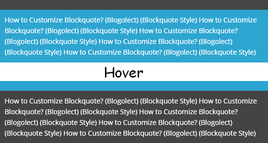
Blockquote or a Block quotation is used to display certain text different from other. It is used for quotations or for showing a special message by the author. Blockquote is also used for displaying codes. You might have seen the customized part of my articles where i put my codes/scripts that i share with you. Every blog has its own blockquote style, but have you ever thought about customizing your blockquote style. If not, or you don't know about customizing blockquote? Don't worry, today in this tutorial we'll show you that How to Customize Blockquote in Blogger. This blockquote also shows a beautiful transition effect on hover and as we know, that the easiest way of customizing any element of a blogger template is by using CSS, so we'll customize this blockquote using CSS.
Recommended:
How to Customize Blockquote in Blogger
How to Customize Blockquote in Blogger How to Customize Blockquote in Blogger

Customize Blockquote in Blogger

First and foremost log in to your Blogger Account >> Select your Blog >> Template >> click Edit HTML >> click inside the code area and use Ctrl+F to search and search for the following tag

]]></b:skin>

Now copy the below code and paste it just above/before it (]]></b:skin> tag)

.post blockquote {background: #2aa4cf;
padding: 10px;
color: #ffffff;
border-top: 20px solid #444;transition:border-top-color 400ms;-webkit-transition:border-top-color 400ms;-moz-transition:border-top-color 400ms;}
.post blockquote:hover {background:#444; border-top-color:#2aa4cf;}

Hit the Save Template button.
Congratulations: You've successfully customized your blockquote in blogger.

From Editors Desk

We hope this tutorial may have helped you in customizing your blockquote. Share this post with your friends and don't forget to subscribe us.

How to Create 3D Rolling Link Effect Using CSS in Blogger

- 1 Comment
Everything is possible with the power of CSS. You can do whatever you want using CSS. While customizing your template or adding effects to blog elements, everything you do for beautifying your blog is based on CSS and today we are also going to share a beautiful CSS effect known as 3D Rolling Link Effect. I hope that you'll love it and this effect will make your blog different and unique from other blogs. So without any further delay let’s install this 3D Rolling Link Effect. All you need is just to add the CSS code first and then the HTML for that link. See how it looks and play with it on jsfiddle.net, hove the text in the results section to see how it looks.
Create 3D Rolling Link Effect Using CSS in Blogger

Create 3D Rolling Link Effect Using CSS in Blogger

First and foremost log in to your Blogger Account >> Select your Blog >> Template >> click Edit HTML >> click inside the code area and use Ctrl+F to search and search for the following tag

]]></b:skin>

Now copy the below code and paste it just above/before it (]]></b:skin> tag)

.bgt-roll-link {
    color: #2aa4cf;
    text-decoration: none;
    font-weight:bold;
    display: inline-block;
    overflow: hidden;
    vertical-align: top;
   
    -webkit-perspective: 600px;
       -moz-perspective: 600px;
       -ms-perspective: 600px;
       perspective: 600px;

    -webkit-perspective-origin: 50% 50%;
       -moz-perspective-origin: 50% 50%;
       -ms-perspective-origin: 50% 50%;
       perspective-origin: 50% 50%;      
}
.bgt-roll-link:hover {text-decoration:none; color: #2aa4cf; font-weight:bold;}
.bgt-roll-link span {
    display: block;
    position: relative;
    padding: 0 2px;

    -webkit-transition: all 300ms ease;
       -moz-transition: all 300ms ease;
       -ms-transition: all 300ms ease;
       transition: all 300ms ease;
   
    -webkit-transform-origin: 50% 0%;
       -moz-transform-origin: 50% 0%;
       -ms-transform-origin: 50% 0%;
       transform-origin: 50% 0%;
   
    -webkit-transform-style: preserve-3d;
       -moz-transform-style: preserve-3d;
       -ms-transform-style: preserve-3d;
       transform-style: preserve-3d;
}
.bgt-roll-link:hover span {
        background: #2aa4cf;        

        -webkit-transform: translate3d( 0px, 0px, -30px ) rotateX( 90deg );
           -moz-transform: translate3d( 0px, 0px, -30px ) rotateX( 90deg );
           -ms-transform: translate3d( 0px, 0px, -30px ) rotateX( 90deg );
           transform: translate3d( 0px, 0px, -30px ) rotateX( 90deg );
}

.bgt-roll-link span:after {
    content: attr(data-title);
    display: block;
    position: absolute;
    left: 0;
    top: 0;
    padding: 0 2px;
    color: #fff;
    background: #2aa4cf;

    -webkit-transform-origin: 50% 0%;
    -moz-transform-origin: 50% 0%;
    -ms-transform-origin: 50% 0%;
    transform-origin: 50% 0%;

    -webkit-transform: translate3d( 0px, 105%, 0px ) rotateX( -90deg );
    -moz-transform: translate3d( 0px, 105%, 0px ) rotateX( -90deg );
    -ms-transform: translate3d( 0px, 105%, 0px ) rotateX( -90deg );
    transform: translate3d( 0px, 105%, 0px ) rotateX( -90deg );
    a.roll-link:link, a.roll-link:visited{color:red;}
}

Hit the Save Template button. Now the HTML, copy the HTML code below and paste it where you want to use this effect.

<a class="bgt-roll-link" href="http://blogolect.com/"><span data-title="Blogolect - All About Blogging">Blogolect - All About Blogging</span></a>

Customization:
  • Replace Blogolect - All About Blogging and Blogolect - All About Blogging with your Link text.
  • Replace http://blogolect.com/ with your Link.

To use this link effect in your blogger blog posts, switch your post editor to HTML mode and add the above HTML code where you want to use it.
Congratulations: You've successfully added this 3D Rolling Link Effect to your blog.

From Editors Desk

We hope this tutorial may have helped you in creating a 3D Rolling Link Effect for your Blog. Share this post with your friends and don't forget to subscribe us. Got a Question? Let us know in the comments section below.

How to Add Turn Off Lights Video Effect in Blogger

- 3 Comments
You might have seen Turn Off the Lights effect on some top video blogs. Turn Off the Lights effect is created with the help of jQuery and it is used make the background darkish while watching a video online. On clicking Turn off the Lights the whole page darkens except the video and let you watch video as if you are in the cinema. Again on clicking Turn on the Lights will switch the background to normal. This effect is great for those people having a video blog, in a way that nothing will distract your visitors while watching a video. Today. in this article we'll show you that How to Add Turn Off Lights Video Effect in Blogger. Just follow these simple steps to add this effect to your blog.

Add Turn Off Lights Video Effect in Blogger

Step 1. Log in to your Blogger Account >> Select a Blog and go to Template >> Edit HTML >> Search for the </head> tag and add the following script just above/before it

<script type='text/javascript'>
//<![CDATA[
$(document).ready(function(){
$("#lightsoff").css("height", $(document).height()).hide();
$(".lightSwitcher").click(function(){
$("#lightsoff").toggle();
if ($("#lightsoff").is(":hidden"))
$(this).html("Turn off the lights").removeClass("turnedOff");
else
$(this).html("Turn on the lights").addClass("turnedOff");
});
});
//]]>
</script>

Step 2. Again Search for the ]]></b:skin> and add the following code above it

/* Turn off Lights
-------------------- */
#lightsVideo {
position:relative;
z-index:102;
}
#switch {
max-width:640px;
text-align:left;
position:relative;
height:25px;
display:block;
margin: 25px 0 0 60px;
}
.lightSwitcher {
position:absolute;
z-index:101;
background-image:url(https://blogger.googleusercontent.com/img/b/R29vZ2xl/AVvXsEg9Vr9n3cerwmKWQblfB0niBM10mU4GQOcrUjVogCuBiFJ46x6svtrv3RBHIYKiE_0rwka0zXhrnpJkzuHp_FXNDANbUl4rj9qdZs8rucdwFrCmxpc2bwmosdClf6kiVvXSDBuweWCsyWrQ/s1600/lights-on.png);
background-repeat:no-repeat;
background-position:left;
padding: 0 0 0 20px;
outline:none;
text-decoration:none;
}
.lightSwitcher:hover {text-decoration:underline;}
.turnedOff {
color:#ffff00 !important;
background-image:url(https://blogger.googleusercontent.com/img/b/R29vZ2xl/AVvXsEhhBF6E_BIU45l-2NVsml7HH4xQOHktqo5Rj1eD3mb-AKVvMHxJNHKG0xEKdNYPkbCDbqvcUq2r2ukcp98K2Wd3M3Pl8SvD_e_i9gZ42Q4CCpAQ174P0qbl16ySpYrJ-SxZ807CTxwslC62/s1600/lights-off.png);
}
#lightsoff {
background:#000;
opacity:0.9;
filter:alpha(opacity=90);
position:absolute;
left:0;
top:0;
width:100%;
z-index:100;
}

Step 3. Now search for the </body> tag and add the following code above it

<div id='lightsoff'/>

Step 4. Click the Save Template button and you're done.
Now wherever you want to add the video use the below code and replace Your-Video-Here with the embed code of your video. To add this video in a post, go to Post Editor, click on HTML Tab and use the below code for adding the video

<center>
<div id="switch">
<a class="lightSwitcher" href="javascript:void(0);">Turn off the lights</a>
</div>
<div id="lightsVideo">
Your-Video-Here
 </div>
</center>

Congratulations: You've successfully added Turn off Lights Video effect to your blog.

From Editors Desk

We hope this tutorial may have helped you in learning How to Add Turn Off Lights Video Effect in Blogger. Share this post with your friends and don't forget to subscribe us. Got a Question? Ask us in comments!

How to Add a Spoiler or Hide/Show Button in Blogger

- 31 Comments
Impressing you visitors is important for driving more traffic to your blog. Everybody knows that content is the king and its important to write good and interesting content. You can also impress your visitors by adding special effects to your blog posts and today we're going to share one of them. This effect is known as spoiler or hide/show effect. This effect displays a button with text, clicking it will expand the content and on clicking it again will hide the content. It uses a simple script and you can use it anywhere. You can hide whatever you want an image, code, text etc. So today in this tutorial we'll learn that How to Add Spoiler or Hide/Show Button in Blogger. See it in action, click the button below :-

How to Add Spoiler or Hide/Show Button in Blogger

How to Add Spoiler or Hide/Show Button in Blogger

Adding this button/spoiler to a blogger post is extremely easy, simply Copy (Ctrl+C) the below code >> In the blogger post editor click on HTML tab and Paste (CTRL+V) it where you want to add this button.

<div id="spoiler" style="display:none">
ADD YOUR HIDDEN CONTENT HERE
</div>
<button title="Click to Show/Hide Content" type="button" onclick="if(document.getElementById('spoiler') .style.display=='none') {document.getElementById('spoiler') .style.display=''}else{document.getElementById('spoiler') .style.display='none'}">Show/Hide</button>

Customization:
Replace ADD YOUR HIDDEN CONTENT HERE with the content that you want to show on click
You can also replace button text i.e Show/Hide
That's it, you're done.

From Editors Desk

We hope this article has helped you in learning How to Add Spoiler or Hide/Show Button in Blogger. Share it with your friends and don't forget to subscribe us :-)

How to Add CSS Borders in Blogger - Complete Guide

- 6 Comments
Today, in this article we are going to discuss about CSS Borders. When it comes to our blog design, we use different techniques and methods to make our blog more beautiful. We use CSS transitions, backgrounds, shadows etc. There are hundreds of techniques that you can use to make your blog more beautiful and one of them is border. Simply, we can say that a border is separating line between two elements/sections. You can use borders for your navigation menus, headings, sidebar headings or whatever you want. If you don't know that How to Add CSS Borders in Blogger, so today in this article we'll learn that How to Add CSS Borders in Blogger.

Simple Border

Simple Border

CSS Code ::

border: 4px solid #000000;

The above code is for adding a simple border. 4px is the width of border and #000000 is the color of border. You can change them according to your own need e.g 1px, 2px, 6px, 8px etc. You can use our color code generators for HTML color codes.

Colorful Sides

Colorful Border

CSS Code ::

border-bottom: 3px solid #000000;
border-top: 3px solid #d33a38;
border-left: 3px solid #2aa4cf;
border-right: 3px solid #00cc00

This is a border having different colors for its four sides. The first line is for bottom border, 3px and #000000 is the width and color of the bottom border. The second line is for top border, 3px and #d33a38 is the width and color of the top border. The third line is for left border, 3px and #2aa4cf is the width and color of the left border. The fourth line is for right border, 3px and #00cc00 is the width and color of the top border.

Border Radius

Border with Radius

CSS Code ::

border: 4px solid #000000;
border-radius:8px;

This is a border with rounded corners. It is done by adding border radius. In the above code 4px is the width of border, #000000 is the color and 8px is radius of the border. You can change then according to your own need.

Colorful Border with Radius

Colorful Border with Radius

CSS Code ::

border-bottom: 3px solid #000000;
border-left: 3px solid #2aa4cf;
border-right: 3px solid #00cc00;
border-top: 3px solid #d33a38;
border-radius:8px;

This is a colorful border with radius. The first line is for bottom border, 3px and #000000 is the width and color of the bottom border. The second line is for top border, 3px and #d33a38 is the width and color of the top border. The third line is for left border, 3px and #2aa4cf is the width and color of the left border. The fourth line is for right border, 3px and #00cc00 is the width and color of the top border and 8px in the last line is its radius. You can change all these colors, radius and its width according to your own need.

One Sided Border


Left Side

border-left: 4px solid #000000;

Left sided border. 4px is the width and #000000 is the color of the border.

Right Side

border-left: 4px solid #000000;

Left sided border. 4px is the width and #000000 is the color of the border.
Border Top

border-top: 4px solid #000000;

Top Border. 4px is the width and #000000 is the color of the border.

Border Bottom

border-bottom: 4px solid #000000;

Bottom Border. 4px is the width and #000000 is the color of the border.

Border Styles

Dashed Border

CSS Code ::

border: 4px dashed #000000;

Inset Border

CSS Code ::

border: 4px inset #000000;

Double Border

CSS Code ::

border: 4px double #000000;

You can also use different styles for each side.

border-top-style: dotted;    
border-right-style: solid;    
border-bottom-style: dotted;    
border-left-style: solid;

Border Styles with their Names:
You can use any style that you want.

From Editors Desk

We hope that you've completely learned about adding CSS borders. Got a problem? Let us know in the comments. Share this article with your friends and don't forget to subscribe us.

Add CSS3 Hover Animation Effect to Post Titles in Blogger

- 53 Comments
You might have seen hover effect on post titles on many blogs (especially in blogger blogs). Adding a CSS3 hover animation effect to post titles will increase your readership and it'll also attract your readers. One of our readers asked us that how to add a link nudge effect to post titles in blogger. So, today in this article we are going to learn how to add CSS3 hover animation effect to post titles in Blogger. How it works? Click on the demo button and move your mouse cursor over any post title to see how it works.

Add CSS3 Hover Animation Effect to Post Titles in Blogger

Step 1. Log in toy your Blogger Account
Step 2. Go to Template >> Edit HTML and search for the ]]></b:skin> tag
Step 3. Now copy the below code and paste it just above/before it

.post h2 {
margin:.1em 0 0;
padding:0 0 4px;
font-size:1.0em;
font-weight:normal;
line-height:2.5em;
color:#444;
font-family: Oswald, Serif;
}
.post h2 a, .post h2 a:visited, .post h2 strong {
display:block;
text-decoration:none;
color:#444;
font-size:2.0em;
font-weight:normal;
font-family: Oswald, Serif;
}
.post h2 strong, .post h2 a:hover {
color:#2aa4cf;
padding: 0px 00px 0px 10px;
-moz-transition: all 1s ease-out;
-o-transition: all 1s ease-out;
-webkit-transition: all 1s ease-out;
-ms-transition: all 1s ease-out;
transition: all 1s ease-out;
}

Step 4. Click on Save Template button
And you're done!

From Editors Desk

We hope this article helped you in learning How to Add CSS3 Hover Animation Effect to Post Titles in Blogger. Share this article with your friends and don't forget to subscribe us!

How to Add CSS3 Rounded Border Wrap in Blogger Templates

- 17 Comments
Adding Rounded Corners body wrapper to your blog is a great way to make your template more beautiful and attractive. By default, there is no border/rounded border wrap in blogger templates. By adding such styles you can make your blog look like professional blogs. This wrapper will make your blog to fit in every screen and it will also attract your visitors. So, today in this article we are going to share How to Add CSS3 Rounded Border Wrap in Blogger Templates.

Add CSS3 Rounded Border Wrap in Blogger Templates

Step 1. Log in to your Blogger Account
Step 2. Go to Template and click on Edit HTML Button
Step 3. Search for the ]]></b:skin> tag
Step 4. Copy the below code and paste it just above/before it

#bgtwrap {
    background: #ffffff;
    width: 965px;
    margin: 10px auto 5px auto;
    padding: 0;
    position: relative;
    border-right: 15px solid #333;
    border-left: 15px solid #333;
    border-top: 10px solid #333;
    border-bottom: 15px solid #333;
    -moz-border-radius:8px;
    -webkit-border-radius:8px;
    border-radius:8px;
    box-shadow: #333 0px 1px 3px;
    }

Step 5. Now search for <body> and paste the below code just below/after it

<div id='bgtwrap'>

Step 6. Finally, search for </body> and paste the below code just above it

</div>

Step 7. Click on Save Template Button
And you're done

Final Words

We hope this article helped you in learning How to Add CSS3 Rounded Border Wrap in Blogger Templates. Share this article with your friends and don't forget to subscribe us!

How to Create a Tooltip For Hyperlink in Blogger

- 2 Comments
What is a tooltip? A tooltip is a text in box which is displayed over a hyperlink, when you move your mouse cursor on the link. Tooltips are used for displaying extra text over links. Tooltips can be used for all sorts of things i.e descriptions, definitions, word meanings etc. You might have seen different types of tooptips on many blogs. So, today we are going to share a simple and beautiful tooltip for your blog. In the image below "Text to Show" is your text and link and the text in the blue box just above it is your tooltip.

How to Create a Tooltip For Hyperlink in Blogger

Step 1. Log in to your Blogger Dashboard
Step 2. Go to Template and Click on Edit HTML button
Step 3. Now search for the ]]></b:skin> tag
Step 4. Copy the below code and paste it just above/before the ]]></b:skin> tag

/* Tooltip Provided by blogolect.blogspot.com */
a:link,
a:visited {
position:relative;
}
.bgttooltip {
width:300px;
position:absolute;
bottom:100%;
margin:0 0 7px 0;
padding:5px;
font-family:Verdana,sans-serif;
font-size:13px;
font-weight:normal;
font-style:normal;
text-align:left;
text-decoration:none;
text-shadow:0 1px 0 rgba(255,255,255,0.3);
line-height:1.5;
border:solid 1px;
-moz-border-radius:0px;
-webkit-border-radius:0px;
border-radius:0px;
-moz-box-shadow:
0 1px 2px rgba(0,0,0,0.3),
0 1px 2px rgba(255,255,255,0.5) inset;
-webkit-box-shadow:
0 1px 2px rgba(0,0,0,0.3),
0 1px 2px rgba(255,255,255,0.5) inset;
box-shadow:
0 1px 2px rgba(0,0,0,0.3),
0 1px 2px rgba(255,255,255,0.5) inset;
cursor:default;
display:block;
visibility:hidden;
opacity:0;
z-index:999;
-moz-transition:all 0.4s linear;
-webkit-transition:all 0.4s linear;
-o-transition:all 0.4s linear;
transition:all 0.4s linear;
color:#2B2B2B;
background:#2aa4cf;
background:-moz-linear-gradient(top,rgba(192,192,192,0.8),rgba(192,192,192,1));
background: #2aa4cf;
border-color:#2aa4cf;
}
.bgttooltip:before,
.bgttooltip:after
{
width:0;
height:0;
position:absolute;
bottom:0;
margin:0 0 -20px -10px;
border:solid 10px;
border-color:transparent;
display:table-cell;
content:"";
}
.bgttooltip:before
{
margin:0 0 -24px -12px;
border:solid 12px;
border-color:transparent;
z-index:-1;
}
a:hover .bgttooltip
{
text-decoration:none;
visibility:visible;
opacity:1;
-moz-transition:all 0.2s linear;
-webkit-transition:all 0.2s linear;
-o-transition:all 0.2s linear;
transition:all 0.2s linear;
}
.bgttooltip,
.bgttooltip.left {
left:0;
right:0;
}
.bgttooltip:before,
.bgttooltip:after,
.bgttooltip.left:before,
.bgttooltip.left:after {
left:40px;
right:auto;
}
.bgttooltip:before {
border-top-color:#2aa4cf;
}
.bgttooltip:after {
border-top-color:#2aa4cf;
}
/* Tooltip Provided by blogolect.blogspot.com */

Step 5. Click on Save Template button

How to Use this Tooltip for Hyperlink

In the post editor click HTML and paste the following code where you want to use it

<a href="Your-Link-URL">Text to Show<span class="bgttooltip">Your Tooltip Text</span></a> 

Customization:
  • Replace Your-Link-URL with your URL 
  • Replace Text to Show with the text you want to show before hover
  • Replace Your Tooltip Text with the text you want to show in tooptip on mouse hover
Step 6. Click on Publish button
And you're done!!

How to Customize Blockquote in Blogger

- 7 Comments
First of all let me tell you that What is Blockquote? Blockquotes are sections of text which are used to highlight quotes from other text or simply a blockquote is used to highlight a text to make it different from other text on the page. Blockquotes are used to draw attention of your readers to particular parts of your blog or if you're a blogger then you can use blockquotes for highlighting code snippets of widgets/CSS codes. Whatever your purpose, using blockquotes is a perfect way to draw your readers attention. So today, in this tutorial we'll show you How to Customize Blockquote in Blogger. Check the image below to see how this blockquote looks that we are going to share today.

How to Customize Blockquote in Blogger

Step 1. Log in to your Blogger Account
Step 2. Go to Template >> Backup your Template and click on Edit HTML
Step 3. Search for .post blockquote and delete the code with all its occurrences. In most templates code looks like this

.post-body blockquote { blaa blaa blaa } 

If your couldn't find it then no problem, its ok
Step 4. Now search for ]]></b:skin> and paste the following code just above/before it

.post blockquote{background:#ddd;border-left:1px solid #333;border-bottom:17px solid #333;border-top:1px solid #333;border-right:1px solid #333; margin-left:20px}
.post blockquote p{padding:10px}

Step 5. Click on Save Template button
And you're done!

How to Use Blockquote

Using blockquote is extremely easy, from the post editor type or paste whatever you want. Select the text/code that you want to show in blockquote and click on Quote tool.

From Editors Desk

We hope this article helped you in learning How to Customize Blockquote in Blogger. Share it with your friends and don't forget to subscribe us!