Don't Miss

Latest Posts
Browsing Category "CSS Tricks"

How to Change Links Color/Style in Blogger

- 22 Comments
Blog design has always been a great challenge for bloggers. Remember, quality content is not the only thing required for making a blog successful, but we also have to give attention to its design that how your blog looks. If your blog design is clean and attractive, then the visitors will get more interested in your blog. There are thousands of blogger templates available on the internet, but not a single template comes with 100% fulfillment. We have to customize its different sections and elements. Links color is also one of the. If you want to make links more visible and stands out from other text or, want to make the design more attractive to enhance user experience, then its important that you customize your link color/style and that's what we are going to learn today. Today in this tutorial we'll show you that How to Change Links Color/Style in Blogger.
How to Change Links Color/Style in Blogger

How to Change Links Color in Blogger

First and foremost log in to your Blogger Account and go to Template >> Edit HTML. Now look for the CSS code of the hyperlink in your template, which would be something like the below code

a { color:#2aa4cf;}
a:hover { color:#000000; }

The text in bold will be different for every template, simply search for a { tag and you'll find the above code. The first line is for you line style before hover (color:#2aa4cf;) and the seconds line is for the link style on hover (color:#000000; ). So by changing the styles and colors you can easily customize your links style. Use our HTML Color code generator to find your color code.

From Editors Desk

We hope this article may've helped you in learning How to Change Links Color/Style in Blogger. Share it with your friedns and dont forget to subscribe us!
Got a question? Please don't hesitate, ask us in the comments section below.

How to Customize Labels Cloud Widget in Blogger

- 5 Comments
Website design has always been a great challenge for bloggers. We spend hours and hours for searching a perfect template and on its design. Okay, say you found a perfect template, but remember not any template is perfect, you've to make customizations. After you found a template, now its time to add some important widgets, such as a popular posts widget, subscription boxes, label cloud, etc. After adding all these widgets, it's important to give them a professional look. If you're a web designer then you can easily customize them, but if not, then don't worry there are hundreds of tutorials available on the internet. So, today in this article we'll show you that how to customize labels cloud widget in blogger. Label Cloud is a widget provided by blogger, which is used to display labels on your blog. Simply labels are tags or categories which we use for categorizing our posts under different groups. You can easily customize Label cloud widget using CSS. Today when I came to update Blogolect, I thought to share something new and I started customizing my label cloud widget on a demo blog. After making some customizations, I created a new labels design using some simple CSS codes and transitions too. This widget shows a beautiful and smooth transition on hover and I hope this widget will give a professional look to your blog.
How to Customize Labels Cloud Widget in Blogger

How to Customize Labels Cloud Widget in Blogger

First and foremost log in to your Blogger Account and go to Template >> Click Edit HTML >> Click inside the code area, use Ctrl+F and search for the ]]></b:skin> tag
Now copy(Ctrl+C) the below code and paste(Ctrl+V) it just above/before the ]]></b:skin> tag

/*--- Custom Label Cloud With CSS3 By Blogolect.com --- */
.Label a{
background:#000;
padding:0 20px;
color:#fff!important;
height:32px;
font-size:14px;
text-transform:uppercase;
text-decoration:none;
line-height:32px;
padding-left:20px;
float:left;
border:none !important;
margin-left:5px;
margin-top:5px;
-webkit-transition:all .4s ease-in-out;-moz-transition:all .4s ease-in-out;-ms-transition:all .4s ease-in-out;-o-transition:all .4s ease-in-out;transition:all .4s ease-in-out;
}
.Label a:hover{
color:#000 !important;
background:#00cc00; }
/*--- Custom Label Cloud With CSS3 By Blogolect.com --- */

Hit the Save Template button and you're done!
Congratulations: You've successfully customized your label cloud widget in blogger.

Add Hover Effect to Your Header Image in Blogger

- 2 Comments
If you're a blogger then you might have seen these gorgeous header hover effect on many blogs and wonder "How do they do that". Don't worry, today we'll teach you how! This effect works on both header text and image. We've created this effect using some simple CSS transitions and it is entirely based on CSS. This effect works on mouseover, on moving you mouse cursor on header image, the image will move to right side with a beautiful transition and zoom effect. Before adding this effect to your blog, have a look on how it works. Click the demo button below:
Add Hover Effect to your Blogger Blog Header

How to Add Hover Effect to your Blogger Blog Header

First and foremost log in to your Blogger Account >> Select a Blog >> Template and Click Edit HTML button. Now click inside the template code area, use Ctrl+F to search and search for the following tag

]]></b:skin>

Now add the below code just above/before it (]]></b:skin> tag)

/*CSS Trick By http://www.blogolect.com Starts*/
#header-inner{
-webkit-transition:all .4s ease-in-out;-moz-transition:all .4s ease-in-out;-ms-transition:all .4s ease-in-out;-o-transition:all .4s ease-in-out;transition:all .4s ease-in-out;}
#header-inner:hover{
margin-left:50px;
-webkit-transform: scale(0.95,0.95);
-moz-transform: scale(0.95,0.95);
-o-transform: scale(0.95,0.95);
-ms-transform: scale(0.95,0.95);
transform: scale(0.95,0.95);
-webkit-transition:all .4s ease-in-out;-moz-transition:all .4s ease-in-out;-ms-transition:all .4s ease-in-out;-o-transition:all .4s ease-in-out;transition:all .4s ease-in-out;
}
/*CSS Trick By http://www.blogolect.com Ends*/

Click the Save Template button and you're done!
Congratulations: You've successfully add hover effect to your blogger blog header.
Note: To share this trick on your blog, please link back to us!

From Editors Desk

We hope that this may have helped you in learning How to Add Hover Effect to your Blogger Blog Header. If you want more cool CSS tricks then subscribe us and receive all updates directly in to your inbox. We'll code some more new CSS tricks in the upcoming days. Stay Tuned!

How to Customize Blockquote in Blogger (v.2)

- 1 Comment
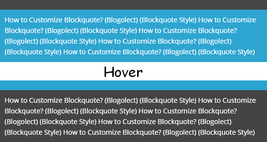
Blockquote or a Block quotation is used to display certain text different from other. It is used for quotations or for showing a special message by the author. Blockquote is also used for displaying codes. You might have seen the customized part of my articles where i put my codes/scripts that i share with you. Every blog has its own blockquote style, but have you ever thought about customizing your blockquote style. If not, or you don't know about customizing blockquote? Don't worry, today in this tutorial we'll show you that How to Customize Blockquote in Blogger. This blockquote also shows a beautiful transition effect on hover and as we know, that the easiest way of customizing any element of a blogger template is by using CSS, so we'll customize this blockquote using CSS.
Recommended:
How to Customize Blockquote in Blogger
How to Customize Blockquote in Blogger How to Customize Blockquote in Blogger

Customize Blockquote in Blogger

First and foremost log in to your Blogger Account >> Select your Blog >> Template >> click Edit HTML >> click inside the code area and use Ctrl+F to search and search for the following tag

]]></b:skin>

Now copy the below code and paste it just above/before it (]]></b:skin> tag)

.post blockquote {background: #2aa4cf;
padding: 10px;
color: #ffffff;
border-top: 20px solid #444;transition:border-top-color 400ms;-webkit-transition:border-top-color 400ms;-moz-transition:border-top-color 400ms;}
.post blockquote:hover {background:#444; border-top-color:#2aa4cf;}

Hit the Save Template button.
Congratulations: You've successfully customized your blockquote in blogger.

From Editors Desk

We hope this tutorial may have helped you in customizing your blockquote. Share this post with your friends and don't forget to subscribe us.

How to Create 3D Rolling Link Effect Using CSS in Blogger

- 1 Comment
Everything is possible with the power of CSS. You can do whatever you want using CSS. While customizing your template or adding effects to blog elements, everything you do for beautifying your blog is based on CSS and today we are also going to share a beautiful CSS effect known as 3D Rolling Link Effect. I hope that you'll love it and this effect will make your blog different and unique from other blogs. So without any further delay let’s install this 3D Rolling Link Effect. All you need is just to add the CSS code first and then the HTML for that link. See how it looks and play with it on jsfiddle.net, hove the text in the results section to see how it looks.
Create 3D Rolling Link Effect Using CSS in Blogger

Create 3D Rolling Link Effect Using CSS in Blogger

First and foremost log in to your Blogger Account >> Select your Blog >> Template >> click Edit HTML >> click inside the code area and use Ctrl+F to search and search for the following tag

]]></b:skin>

Now copy the below code and paste it just above/before it (]]></b:skin> tag)

.bgt-roll-link {
    color: #2aa4cf;
    text-decoration: none;
    font-weight:bold;
    display: inline-block;
    overflow: hidden;
    vertical-align: top;
   
    -webkit-perspective: 600px;
       -moz-perspective: 600px;
       -ms-perspective: 600px;
       perspective: 600px;

    -webkit-perspective-origin: 50% 50%;
       -moz-perspective-origin: 50% 50%;
       -ms-perspective-origin: 50% 50%;
       perspective-origin: 50% 50%;      
}
.bgt-roll-link:hover {text-decoration:none; color: #2aa4cf; font-weight:bold;}
.bgt-roll-link span {
    display: block;
    position: relative;
    padding: 0 2px;

    -webkit-transition: all 300ms ease;
       -moz-transition: all 300ms ease;
       -ms-transition: all 300ms ease;
       transition: all 300ms ease;
   
    -webkit-transform-origin: 50% 0%;
       -moz-transform-origin: 50% 0%;
       -ms-transform-origin: 50% 0%;
       transform-origin: 50% 0%;
   
    -webkit-transform-style: preserve-3d;
       -moz-transform-style: preserve-3d;
       -ms-transform-style: preserve-3d;
       transform-style: preserve-3d;
}
.bgt-roll-link:hover span {
        background: #2aa4cf;        

        -webkit-transform: translate3d( 0px, 0px, -30px ) rotateX( 90deg );
           -moz-transform: translate3d( 0px, 0px, -30px ) rotateX( 90deg );
           -ms-transform: translate3d( 0px, 0px, -30px ) rotateX( 90deg );
           transform: translate3d( 0px, 0px, -30px ) rotateX( 90deg );
}

.bgt-roll-link span:after {
    content: attr(data-title);
    display: block;
    position: absolute;
    left: 0;
    top: 0;
    padding: 0 2px;
    color: #fff;
    background: #2aa4cf;

    -webkit-transform-origin: 50% 0%;
    -moz-transform-origin: 50% 0%;
    -ms-transform-origin: 50% 0%;
    transform-origin: 50% 0%;

    -webkit-transform: translate3d( 0px, 105%, 0px ) rotateX( -90deg );
    -moz-transform: translate3d( 0px, 105%, 0px ) rotateX( -90deg );
    -ms-transform: translate3d( 0px, 105%, 0px ) rotateX( -90deg );
    transform: translate3d( 0px, 105%, 0px ) rotateX( -90deg );
    a.roll-link:link, a.roll-link:visited{color:red;}
}

Hit the Save Template button. Now the HTML, copy the HTML code below and paste it where you want to use this effect.

<a class="bgt-roll-link" href="http://blogolect.com/"><span data-title="Blogolect - All About Blogging">Blogolect - All About Blogging</span></a>

Customization:
  • Replace Blogolect - All About Blogging and Blogolect - All About Blogging with your Link text.
  • Replace http://blogolect.com/ with your Link.

To use this link effect in your blogger blog posts, switch your post editor to HTML mode and add the above HTML code where you want to use it.
Congratulations: You've successfully added this 3D Rolling Link Effect to your blog.

From Editors Desk

We hope this tutorial may have helped you in creating a 3D Rolling Link Effect for your Blog. Share this post with your friends and don't forget to subscribe us. Got a Question? Let us know in the comments section below.

How to Add Turn Off Lights Video Effect in Blogger

- 3 Comments
You might have seen Turn Off the Lights effect on some top video blogs. Turn Off the Lights effect is created with the help of jQuery and it is used make the background darkish while watching a video online. On clicking Turn off the Lights the whole page darkens except the video and let you watch video as if you are in the cinema. Again on clicking Turn on the Lights will switch the background to normal. This effect is great for those people having a video blog, in a way that nothing will distract your visitors while watching a video. Today. in this article we'll show you that How to Add Turn Off Lights Video Effect in Blogger. Just follow these simple steps to add this effect to your blog.

Add Turn Off Lights Video Effect in Blogger

Step 1. Log in to your Blogger Account >> Select a Blog and go to Template >> Edit HTML >> Search for the </head> tag and add the following script just above/before it

<script type='text/javascript'>
//<![CDATA[
$(document).ready(function(){
$("#lightsoff").css("height", $(document).height()).hide();
$(".lightSwitcher").click(function(){
$("#lightsoff").toggle();
if ($("#lightsoff").is(":hidden"))
$(this).html("Turn off the lights").removeClass("turnedOff");
else
$(this).html("Turn on the lights").addClass("turnedOff");
});
});
//]]>
</script>

Step 2. Again Search for the ]]></b:skin> and add the following code above it

/* Turn off Lights
-------------------- */
#lightsVideo {
position:relative;
z-index:102;
}
#switch {
max-width:640px;
text-align:left;
position:relative;
height:25px;
display:block;
margin: 25px 0 0 60px;
}
.lightSwitcher {
position:absolute;
z-index:101;
background-image:url(https://blogger.googleusercontent.com/img/b/R29vZ2xl/AVvXsEg9Vr9n3cerwmKWQblfB0niBM10mU4GQOcrUjVogCuBiFJ46x6svtrv3RBHIYKiE_0rwka0zXhrnpJkzuHp_FXNDANbUl4rj9qdZs8rucdwFrCmxpc2bwmosdClf6kiVvXSDBuweWCsyWrQ/s1600/lights-on.png);
background-repeat:no-repeat;
background-position:left;
padding: 0 0 0 20px;
outline:none;
text-decoration:none;
}
.lightSwitcher:hover {text-decoration:underline;}
.turnedOff {
color:#ffff00 !important;
background-image:url(https://blogger.googleusercontent.com/img/b/R29vZ2xl/AVvXsEhhBF6E_BIU45l-2NVsml7HH4xQOHktqo5Rj1eD3mb-AKVvMHxJNHKG0xEKdNYPkbCDbqvcUq2r2ukcp98K2Wd3M3Pl8SvD_e_i9gZ42Q4CCpAQ174P0qbl16ySpYrJ-SxZ807CTxwslC62/s1600/lights-off.png);
}
#lightsoff {
background:#000;
opacity:0.9;
filter:alpha(opacity=90);
position:absolute;
left:0;
top:0;
width:100%;
z-index:100;
}

Step 3. Now search for the </body> tag and add the following code above it

<div id='lightsoff'/>

Step 4. Click the Save Template button and you're done.
Now wherever you want to add the video use the below code and replace Your-Video-Here with the embed code of your video. To add this video in a post, go to Post Editor, click on HTML Tab and use the below code for adding the video

<center>
<div id="switch">
<a class="lightSwitcher" href="javascript:void(0);">Turn off the lights</a>
</div>
<div id="lightsVideo">
Your-Video-Here
 </div>
</center>

Congratulations: You've successfully added Turn off Lights Video effect to your blog.

From Editors Desk

We hope this tutorial may have helped you in learning How to Add Turn Off Lights Video Effect in Blogger. Share this post with your friends and don't forget to subscribe us. Got a Question? Ask us in comments!

How to Add a Spoiler or Hide/Show Button in Blogger

- 31 Comments
Impressing you visitors is important for driving more traffic to your blog. Everybody knows that content is the king and its important to write good and interesting content. You can also impress your visitors by adding special effects to your blog posts and today we're going to share one of them. This effect is known as spoiler or hide/show effect. This effect displays a button with text, clicking it will expand the content and on clicking it again will hide the content. It uses a simple script and you can use it anywhere. You can hide whatever you want an image, code, text etc. So today in this tutorial we'll learn that How to Add Spoiler or Hide/Show Button in Blogger. See it in action, click the button below :-

How to Add Spoiler or Hide/Show Button in Blogger

How to Add Spoiler or Hide/Show Button in Blogger

Adding this button/spoiler to a blogger post is extremely easy, simply Copy (Ctrl+C) the below code >> In the blogger post editor click on HTML tab and Paste (CTRL+V) it where you want to add this button.

<div id="spoiler" style="display:none">
ADD YOUR HIDDEN CONTENT HERE
</div>
<button title="Click to Show/Hide Content" type="button" onclick="if(document.getElementById('spoiler') .style.display=='none') {document.getElementById('spoiler') .style.display=''}else{document.getElementById('spoiler') .style.display='none'}">Show/Hide</button>

Customization:
Replace ADD YOUR HIDDEN CONTENT HERE with the content that you want to show on click
You can also replace button text i.e Show/Hide
That's it, you're done.

From Editors Desk

We hope this article has helped you in learning How to Add Spoiler or Hide/Show Button in Blogger. Share it with your friends and don't forget to subscribe us :-)

How to Add CSS Borders in Blogger - Complete Guide

- 6 Comments
Today, in this article we are going to discuss about CSS Borders. When it comes to our blog design, we use different techniques and methods to make our blog more beautiful. We use CSS transitions, backgrounds, shadows etc. There are hundreds of techniques that you can use to make your blog more beautiful and one of them is border. Simply, we can say that a border is separating line between two elements/sections. You can use borders for your navigation menus, headings, sidebar headings or whatever you want. If you don't know that How to Add CSS Borders in Blogger, so today in this article we'll learn that How to Add CSS Borders in Blogger.

Simple Border

Simple Border

CSS Code ::

border: 4px solid #000000;

The above code is for adding a simple border. 4px is the width of border and #000000 is the color of border. You can change them according to your own need e.g 1px, 2px, 6px, 8px etc. You can use our color code generators for HTML color codes.

Colorful Sides

Colorful Border

CSS Code ::

border-bottom: 3px solid #000000;
border-top: 3px solid #d33a38;
border-left: 3px solid #2aa4cf;
border-right: 3px solid #00cc00

This is a border having different colors for its four sides. The first line is for bottom border, 3px and #000000 is the width and color of the bottom border. The second line is for top border, 3px and #d33a38 is the width and color of the top border. The third line is for left border, 3px and #2aa4cf is the width and color of the left border. The fourth line is for right border, 3px and #00cc00 is the width and color of the top border.

Border Radius

Border with Radius

CSS Code ::

border: 4px solid #000000;
border-radius:8px;

This is a border with rounded corners. It is done by adding border radius. In the above code 4px is the width of border, #000000 is the color and 8px is radius of the border. You can change then according to your own need.

Colorful Border with Radius

Colorful Border with Radius

CSS Code ::

border-bottom: 3px solid #000000;
border-left: 3px solid #2aa4cf;
border-right: 3px solid #00cc00;
border-top: 3px solid #d33a38;
border-radius:8px;

This is a colorful border with radius. The first line is for bottom border, 3px and #000000 is the width and color of the bottom border. The second line is for top border, 3px and #d33a38 is the width and color of the top border. The third line is for left border, 3px and #2aa4cf is the width and color of the left border. The fourth line is for right border, 3px and #00cc00 is the width and color of the top border and 8px in the last line is its radius. You can change all these colors, radius and its width according to your own need.

One Sided Border


Left Side

border-left: 4px solid #000000;

Left sided border. 4px is the width and #000000 is the color of the border.

Right Side

border-left: 4px solid #000000;

Left sided border. 4px is the width and #000000 is the color of the border.
Border Top

border-top: 4px solid #000000;

Top Border. 4px is the width and #000000 is the color of the border.

Border Bottom

border-bottom: 4px solid #000000;

Bottom Border. 4px is the width and #000000 is the color of the border.

Border Styles

Dashed Border

CSS Code ::

border: 4px dashed #000000;

Inset Border

CSS Code ::

border: 4px inset #000000;

Double Border

CSS Code ::

border: 4px double #000000;

You can also use different styles for each side.

border-top-style: dotted;    
border-right-style: solid;    
border-bottom-style: dotted;    
border-left-style: solid;

Border Styles with their Names:
You can use any style that you want.

From Editors Desk

We hope that you've completely learned about adding CSS borders. Got a problem? Let us know in the comments. Share this article with your friends and don't forget to subscribe us.